INSPIRATION
INSPIRATION

Mother's Day
Give the Gift of Quality Time This Mother’s Day
If you’re on the hunt for the best Mother’s Day gift ideas that will leave her feeling loved and appreciated this Sunday, May 12th.
Mother's Day
What The Mum of Toddlers in Your Life Really Wants for Mother’s Day
After surviving the years of tantrums and tears – the Mothers in your life enduring the toddler stage are likely looking for some adult interaction and time away from the chaos this Mother’s Day!

Mother's Day
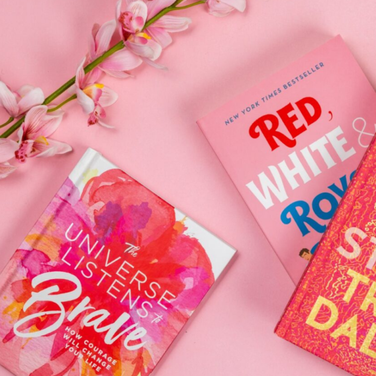
Mother's Day Personalised Giftware
Create something personal and unique for Mum this Mother's Day

NEW, FASHION
Discover Versace Man Capsule at OPSM
Iconic heritage meets modern elegance in the Versace Man Capsule starring Dwayne Wade. Explore the collection and discover this new frame colour available only at OPSM.

Mother's Day
There's Something to Suit Every Mum at OPSM
Mother's Day is just around the corner, and what better way to show your love and appreciation than with the gift of style.

Mother's Day
Pomegranate and violet granita cocktail
Part cocktail, part dessert – this Pomegranate Vodka Violet Granita is the perfect cocktail to make mum this Mother’s Day.

Mother's Day
Ham and Cheese Croissant Bake
Elevate your brunch game this Mother’s Day with a croissant bake that is not only easy to prepare, but extremely tasty.
Mother's Day
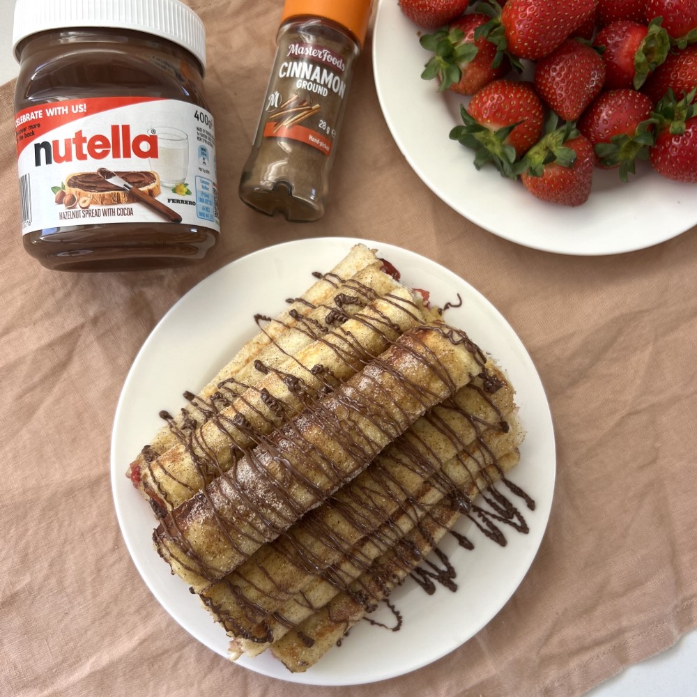
Strawberry and Nutella French Toast Roll Ups
Spoil mum this Mother’s Day with this delectable breakfast treat that she will absolutely love.

Mother's Day, Gifting
Just the perfect (Mother's Day) gift!
Give Mum the gift of fabulous hair with a Just Cuts Gift Card this Mother's Day.

Mother's Day
Four Ways to Spoil a New Mum This Mother’s Day
If you’re on the hunt for the best Mother’s Day gifts to spoil a new mum, then look no further.
FOOD
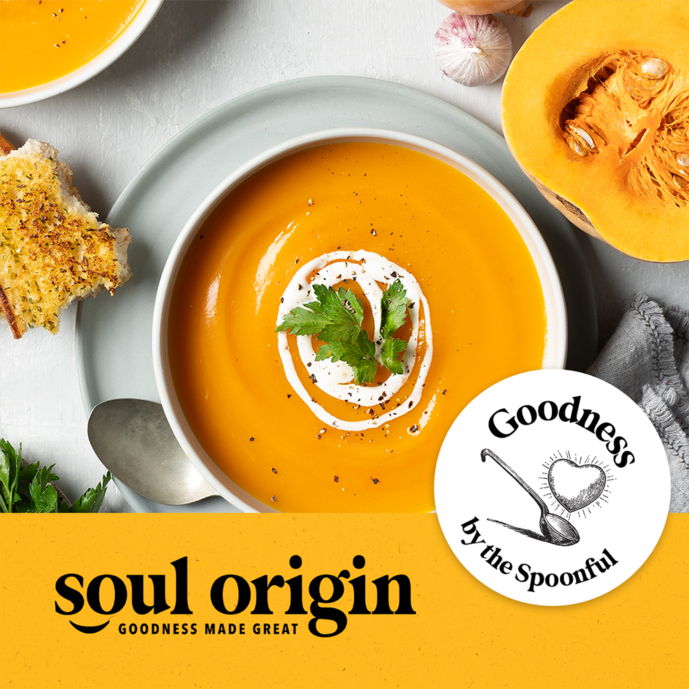
Savour the season with Soul Origin soup
It’s that time of the year again when the unmistakable aroma of wholesome soups wafts through the air, inviting you to take pause and indulge in a piping-hot bowl of comfort. At Soul Origin, we're not just bringing back the classics; we're introducing a feast of new flavours to warm your body and soul. Our soup season is more than just about taste; it's about a culinary adventure that you can savour with every spoonful.
NEW, FOOD & DRINKS
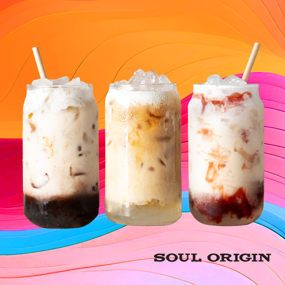
Soul Origin introduces new drinks: SO Pearls
In a world brimming with endless variations of iced beverages, Soul Origin is setting the standard high with a revolutionary new range that's not just a drink but an experience. Introducing the epitome of lusciousness in a cup. SO Pearls - Iced Drinks with Pearls!

Easter
Why does Easter Chocolate Taste so Good?
As this year’s Easter weekend draws near, and there is one question that we all ask ourselves at some point Easter Chocolate just tastes so good?

Easter Activities
Celebrate Easter With Adult Children
At Marrickville Metro we know one thing for sure – you’re never too old to be visited by the Easter Bunny! See our 5 tips to celebrate Easter with adult children.

Mother's Day
Mothers of Tweens, Let’s Celebrate Mother’s Day Together.
Spoil a tween mum with unforgettable experiences – from long-lunches, to beauty trips, and even paint and sips.

Easter
Chocolate Easter Nests
Enjoy this Easter blast from the past with these super quick and easy chocolate nests - the perfect treat for the whole family.

Easter
Easter Chick Wafer Dips
Cooking with kids this Easter? Create these Easter Chick Wafer Dips in 6 simple steps.
Easter
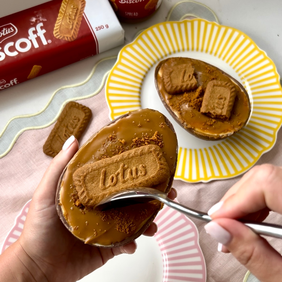
No Bake Biscoff Easter Cheesecake
Create the ultimate Easter dessert with this no bake Biscoff Easter Egg Cheesecake.

Easter
Easter Sorbet Spritz
Yes way, sorbet. For those who love sorbet and fizz, it’s time to treat yourself to an Easter
Sorbet Spritz!
Sorbet Spritz!
Christmas
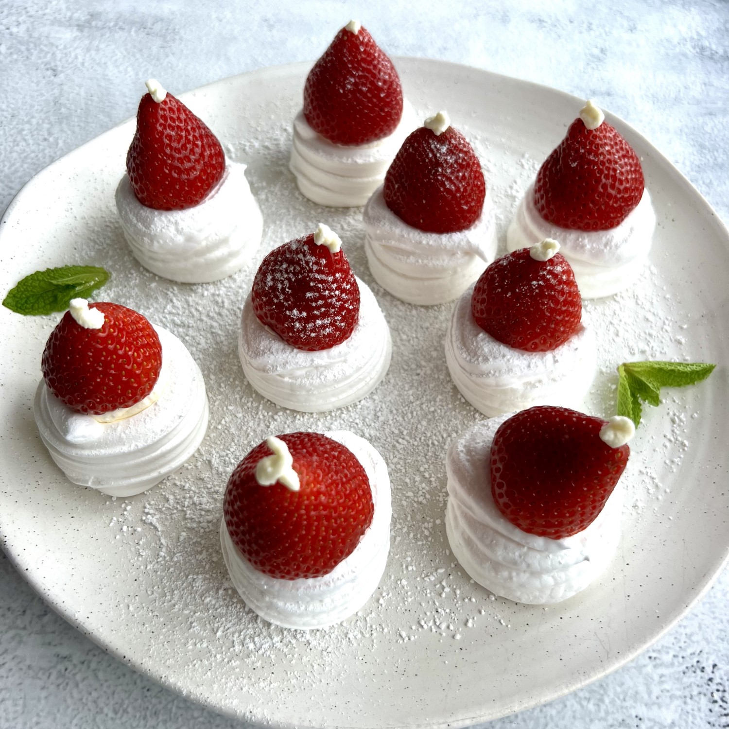
Mini Santa Meringues
These adorable Mini Santa Meringues are the perfect festive treat to make with little ones.
Christmas Recipe
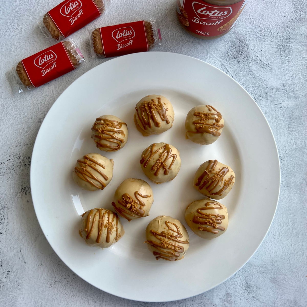
BISCOFF TRUFFLES
Everyone's favourite Biscoff biccies get a Christmas twist. Dipped in Caramilk and coated with Biscoff spread these will fly off the table!
Christmas Recipe
CHRISTMAS LOBSTER ROLLS - CRANBERRY MAYO
Add some festive flair to your holiday menu with this mouthwatering lobster recipe with a medley of seasonal ingredients and flavors.
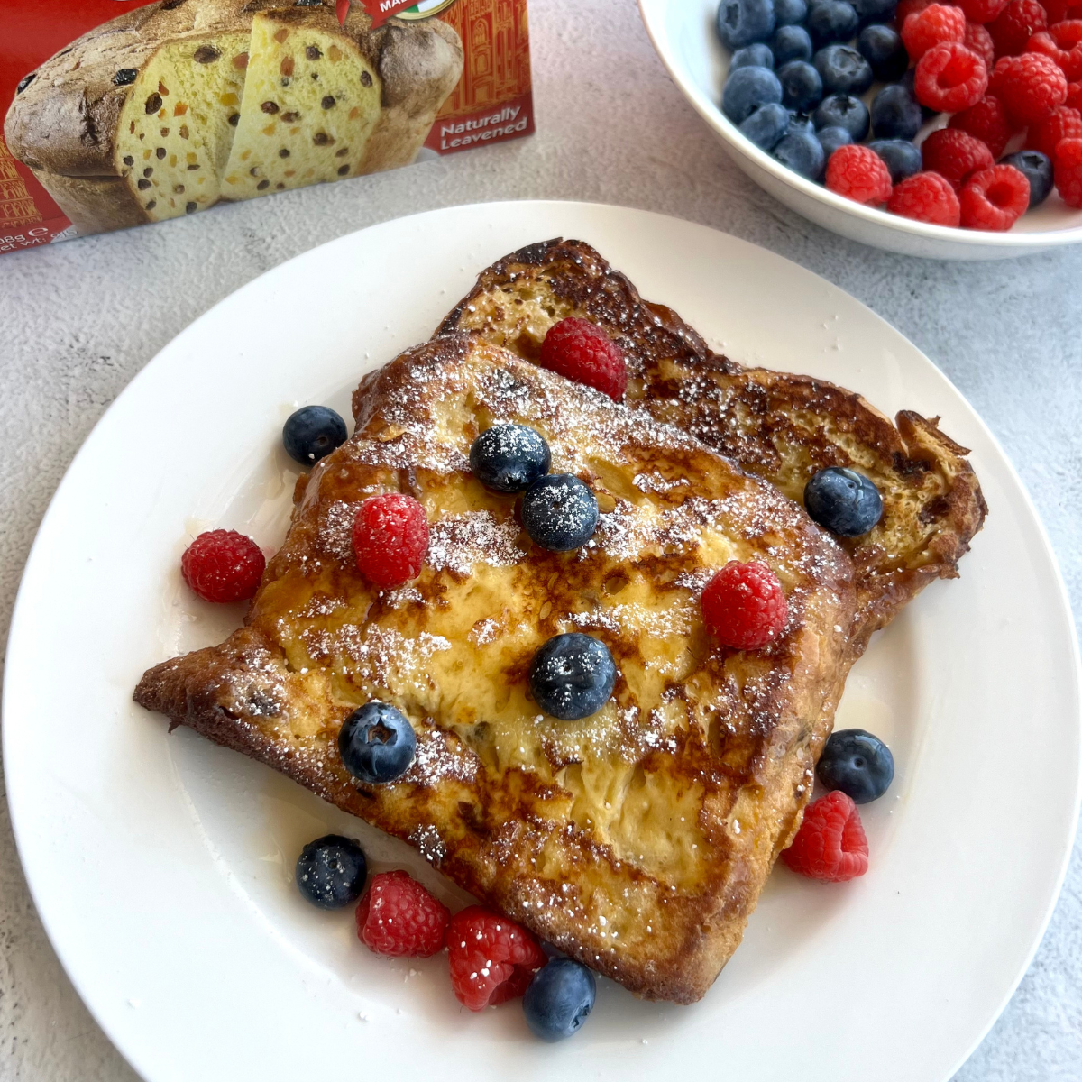
Christmas Recipe
Panettone French Toast
Add a twist to your classic breakfast dish with this delightful Panettone French toast.

Christmas Recipe
CHRISTMAS HASSLEBACK POTATOES
Is there anything better than a classic flavour combo? These potatoes are guaranteed to be delicious with ham, brie and cranberry sauce!
Christmas Recipe
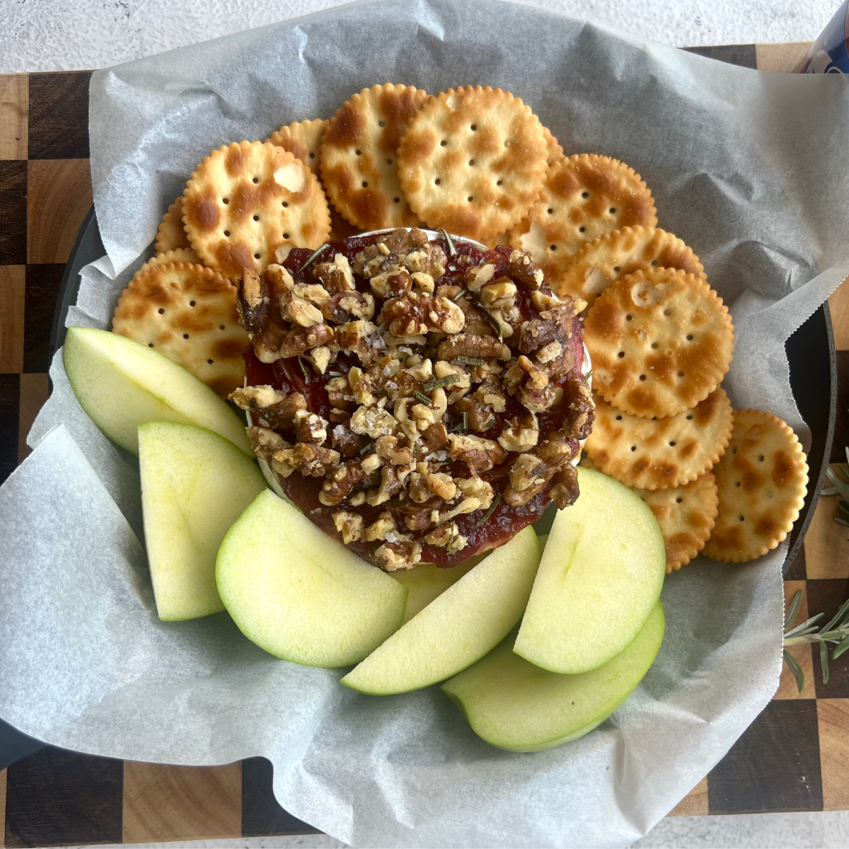
Christmas Baked Brie
This Christmas Baked Brie is an ideal addition to the holiday gathering.
Christmas Recipe
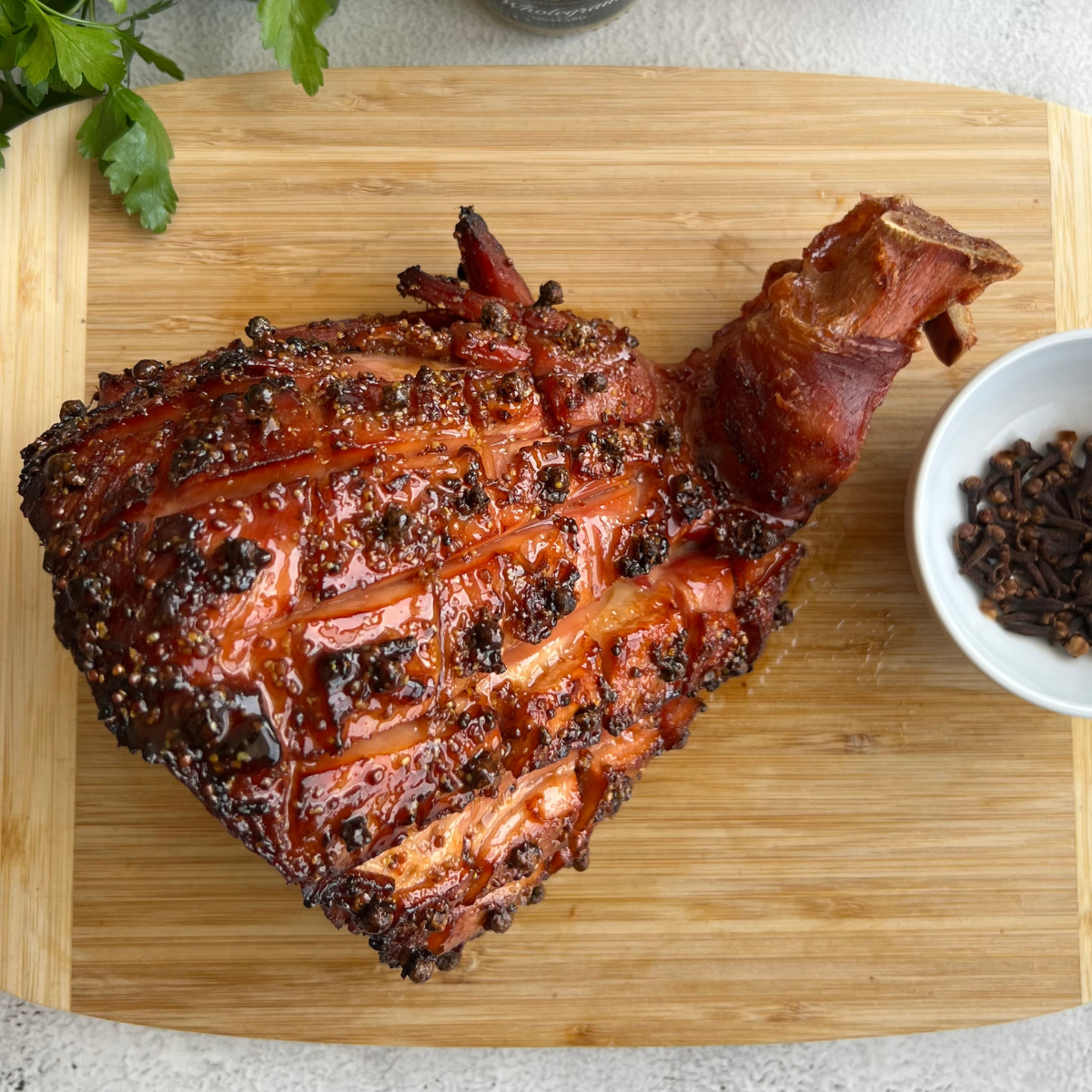
5 INGREDIENT AIR FRYER CHRISTMAS HAM
Level up your smoked ham by adding a sweet & sticky glaze - in your AIRFRYER!
Christmas Recipe
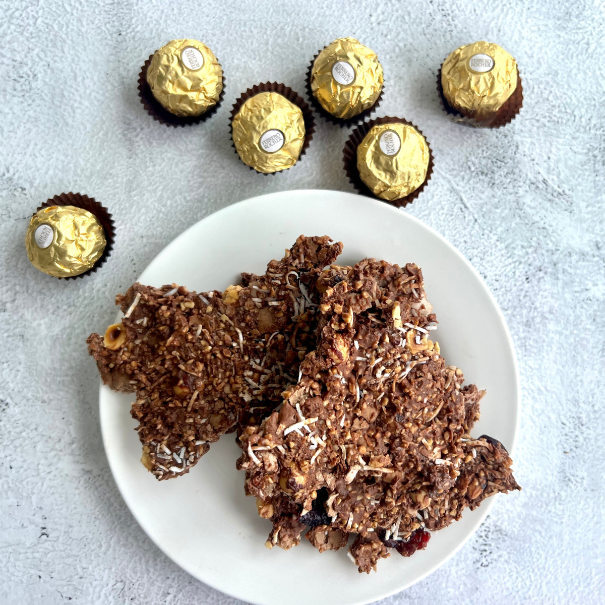
3 INGREDIENT FERRERO ROCHER CHRISTMAS SNAP
3 Ingredient Ferrero Rocher Christmas Snap is a quick and easy-to-make holiday treat.

Halloween
Mini Pizza Fright Bites
Sink your fangs into these spooktacular Halloween mini pizza fright bites!

Halloween
Halloween Chocolate Bark
Treat yourself to this sweet and spooky Halloween Chocolate bark!
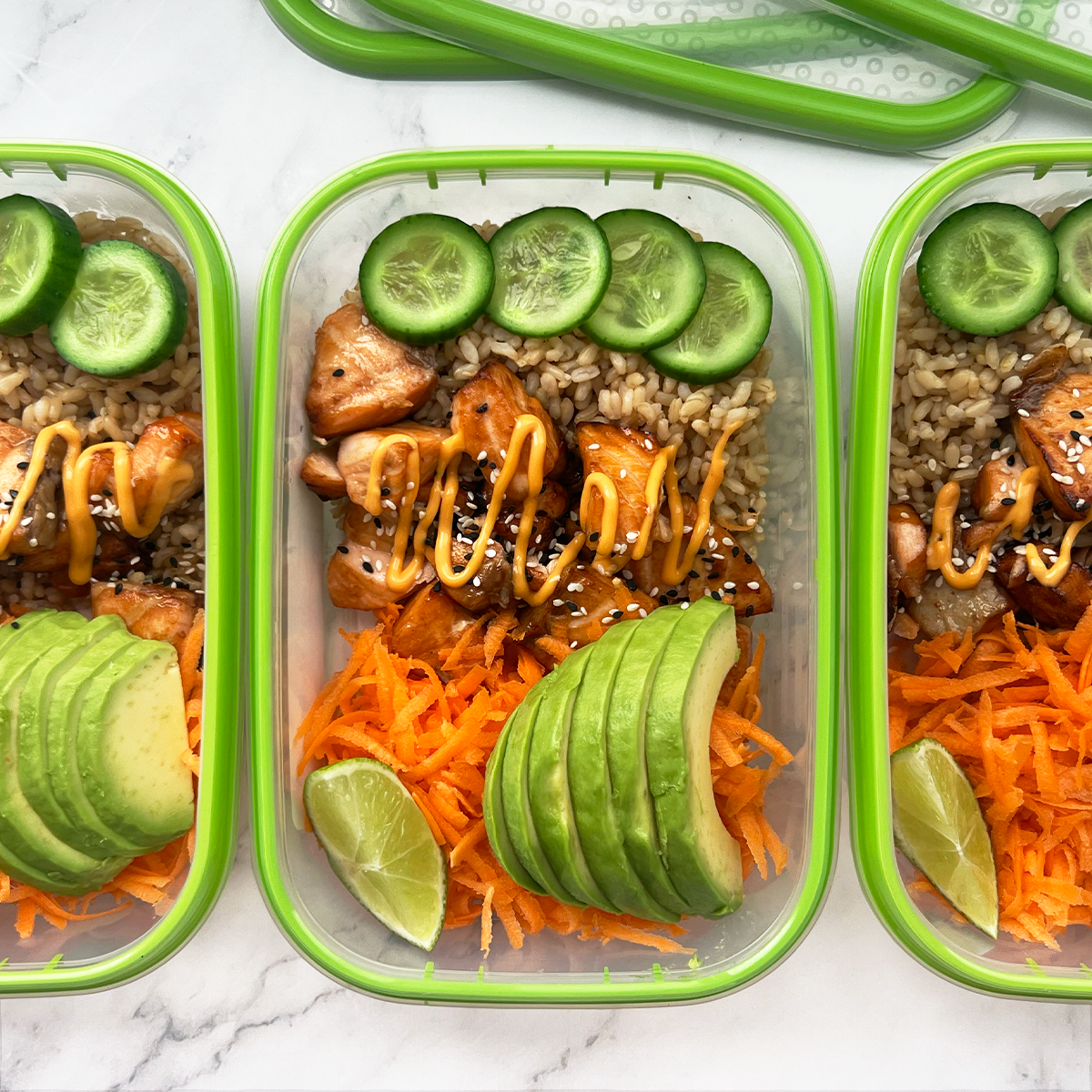
Cold Salmon Sushi Bowl
Sushi bowls can be eaten hot or cold. In this case, we’ve gone for cold so its a fuss free meal prep option. This healthy idea is packed with flavour and full of nutrients including antioxidant superfoods such as salmon, avocado, cucumber and carrot. We’ve opted for brown rice for extra fibre and a sprinkle of sesame seeds which are an excellent source of mangnesium and calcium, both of which help your bones grow healthy and strong.
If salmon isn’t for you, or you work in one of those “don’t bring fish into the office” environments, teriyaki chicken, tofu, or soy sauce marinated vegetables will be just as delicious.
If salmon isn’t for you, or you work in one of those “don’t bring fish into the office” environments, teriyaki chicken, tofu, or soy sauce marinated vegetables will be just as delicious.
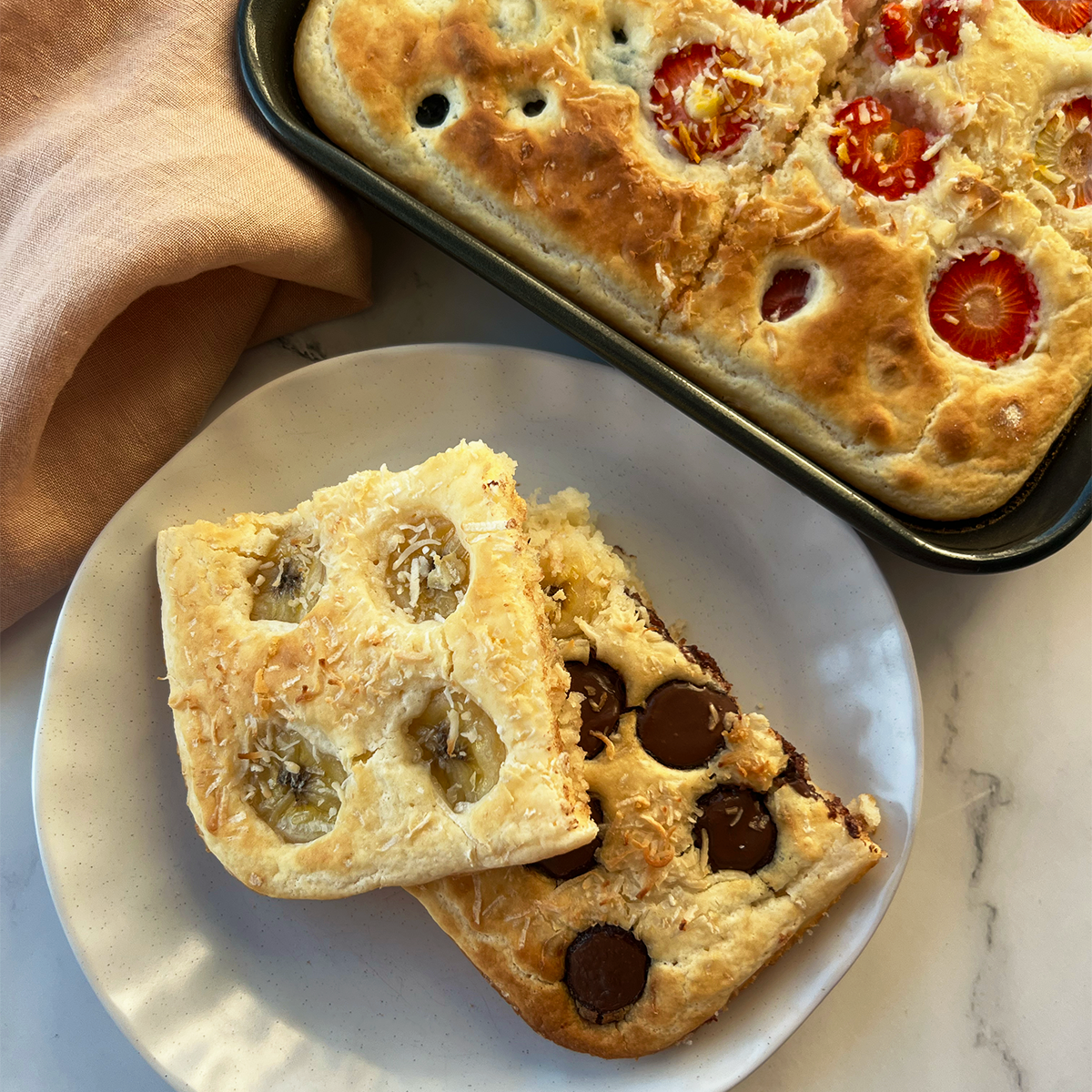
Homebake Breakfast Hack
Pancakes are a favorite in most households, however everyone has their own favourite toppings. With this one sheet pan pancake, you can choose as many toppings/combinations as you like. Think banana and chocolate, lotus biscoff, nutella and strawberries, or even just plain blueberries with a squeeze of lemon. This 20 minute recipe will ensure someone doesn’t have to stand in the kitchen flipping the pancakes while the earlier ones get cold. Instead, this hack will change the way you eat pancakes forever!
We can’t wait to see your delicious creations.
We can’t wait to see your delicious creations.
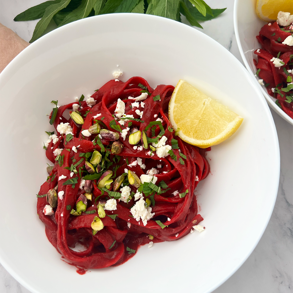
Pink Pasta (vego)
We saw this delicious recipe on the wishbone kitchen and had to make it ourselves. The garnish of feta cheese, chopped pistachios, and fresh mint really rounds out the root vegetable taste. It’s the perfect balance. This date night, meatless dish is under $15 and bound to impress anyone. The pistachios can be swapped for cashews or walnuts and if you aren’t a fan of mint then basil would work perfectly.
The viral baked feta pasta has some competition on their hands…
The viral baked feta pasta has some competition on their hands…
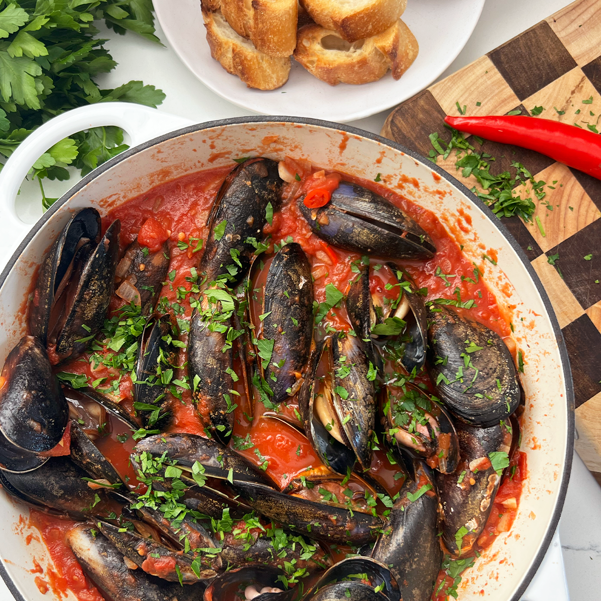
Mussels in a Spicy Tomato Sauce
Mussels in a spicy tomato sauce is an elegant seafood dish that tastes absolutely amazing. T
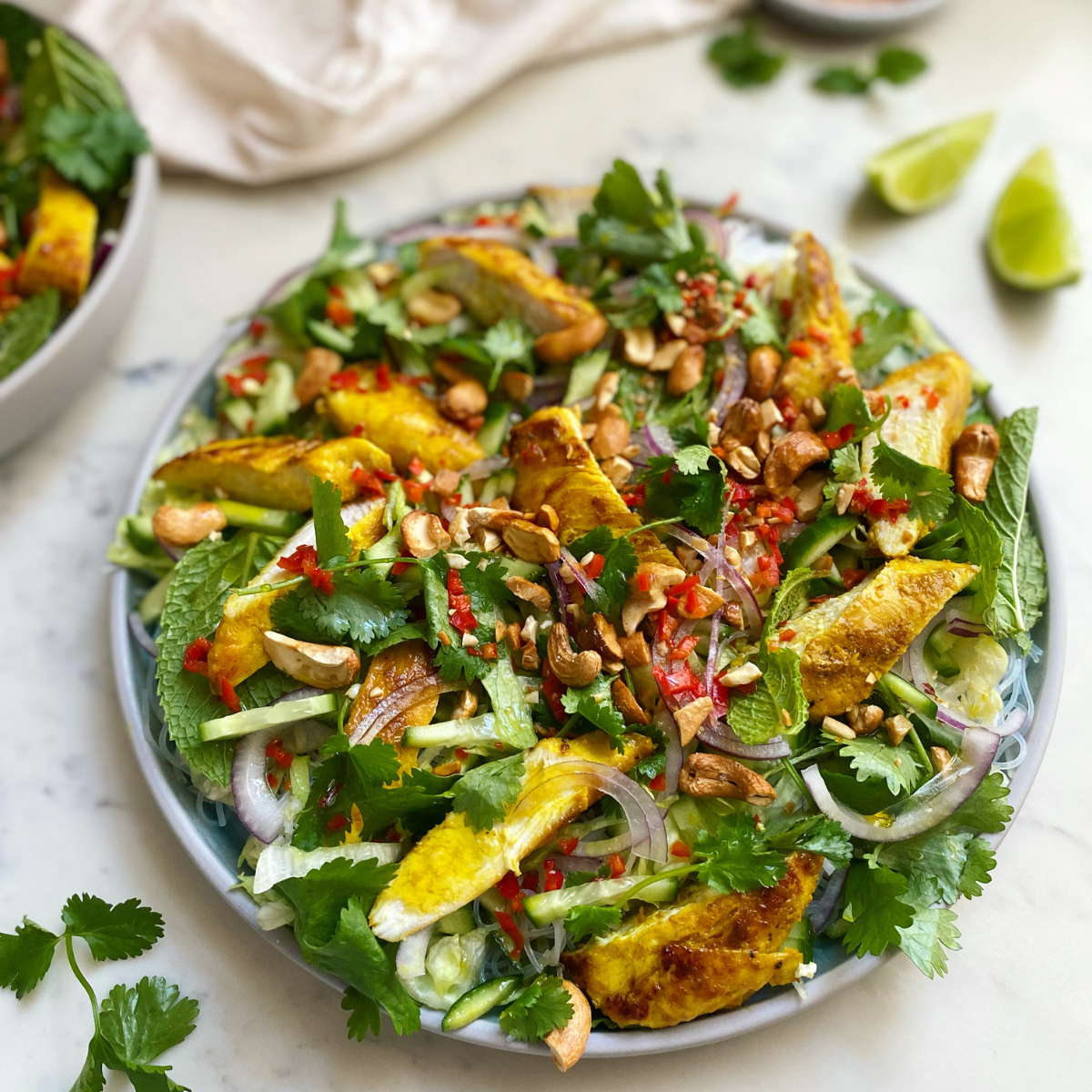
LEMONGRASS CHICKEN & CASHEW RICE NOODLE SALAD
This is a very adaptable recipe so feel free to swap the chicken for beef, pork, lamb, salmon, prawns, mushrooms, tofu or crispy fried eggs!
MANGO & COCONUT NICE CREAM
This plant based treat is the ultimate healthy soft serve to enjoy on a balmy Summers day!
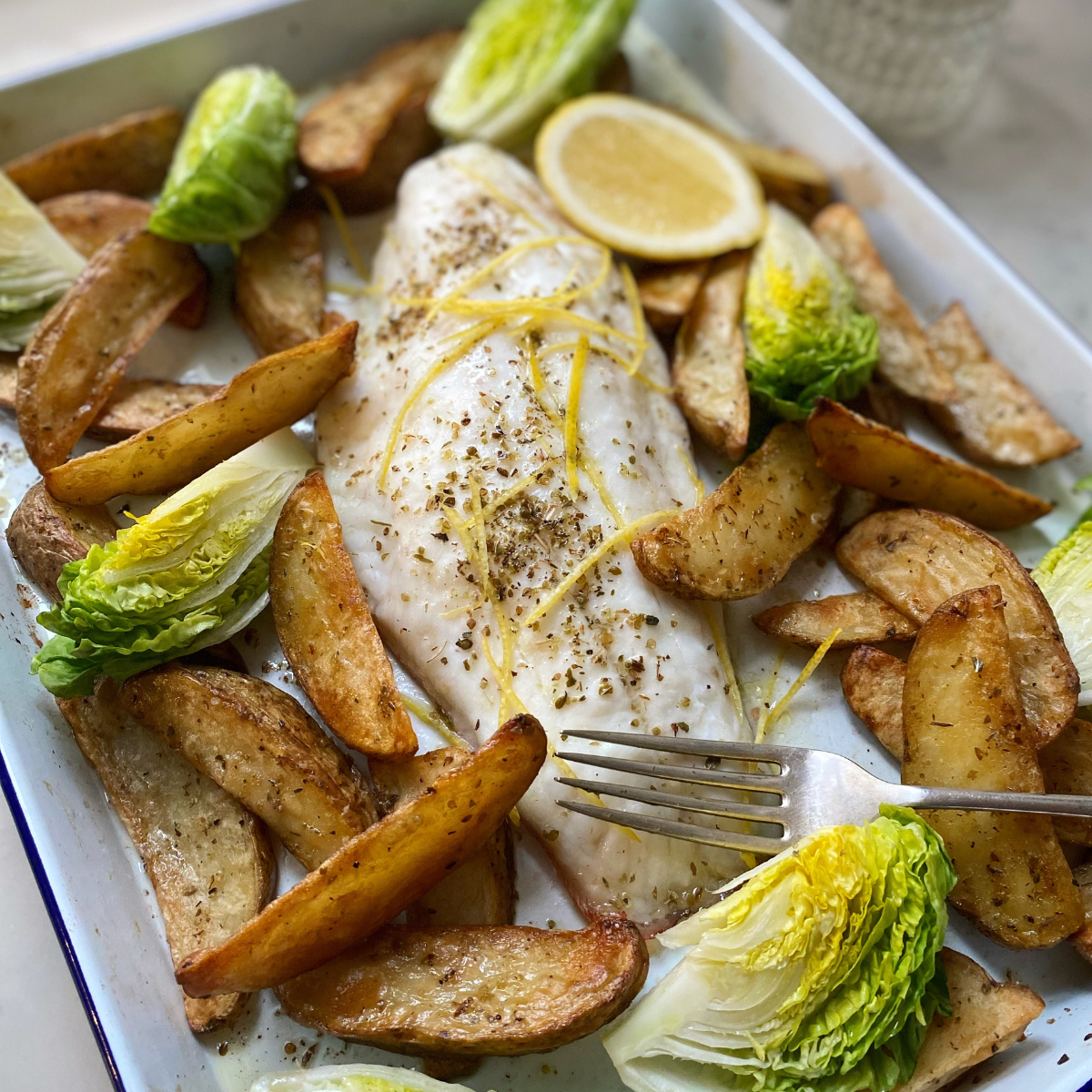
TRAY BAKED FISH AND CHIPS
*Baking fish and chips in the oven is much easier and less messy than deep frying.
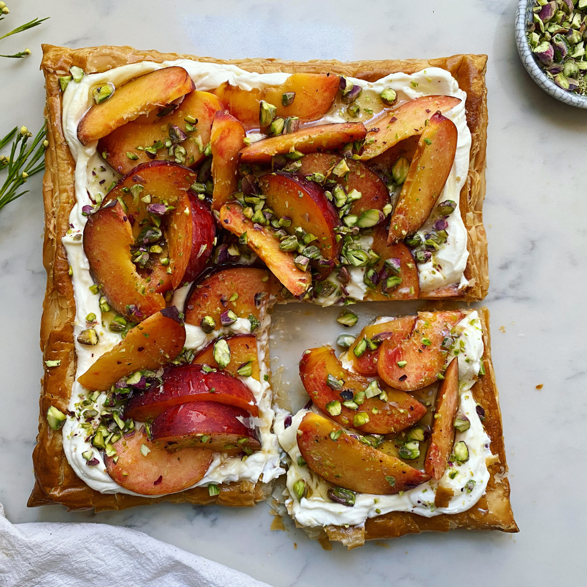
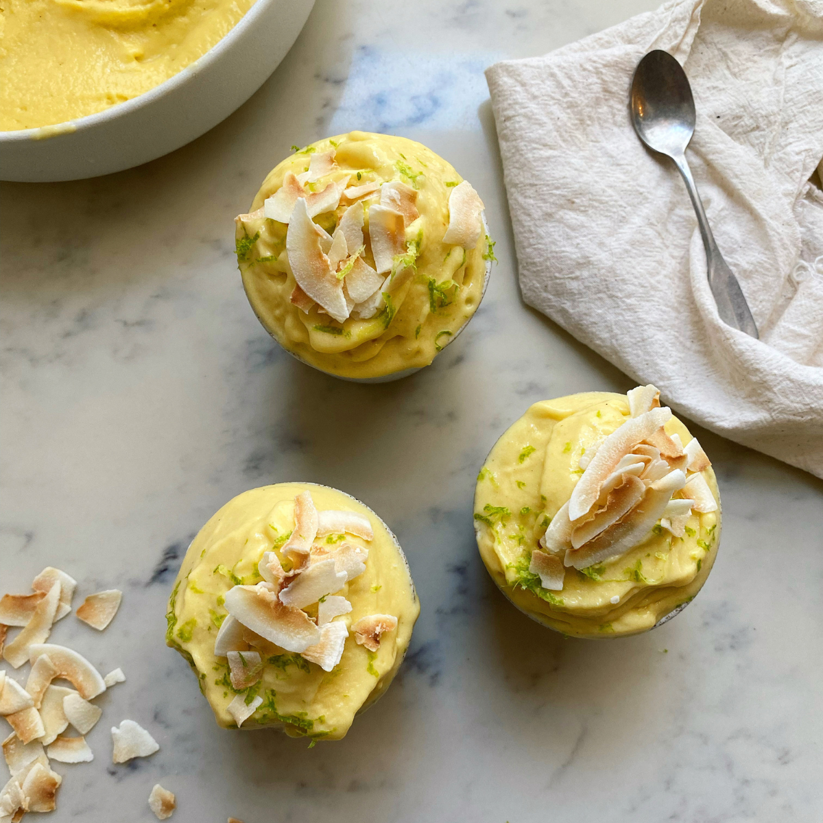
PEACH, PISTACHIO & HONEY TART
This tart recipe is a quick and easy 5 ingredients dessert.
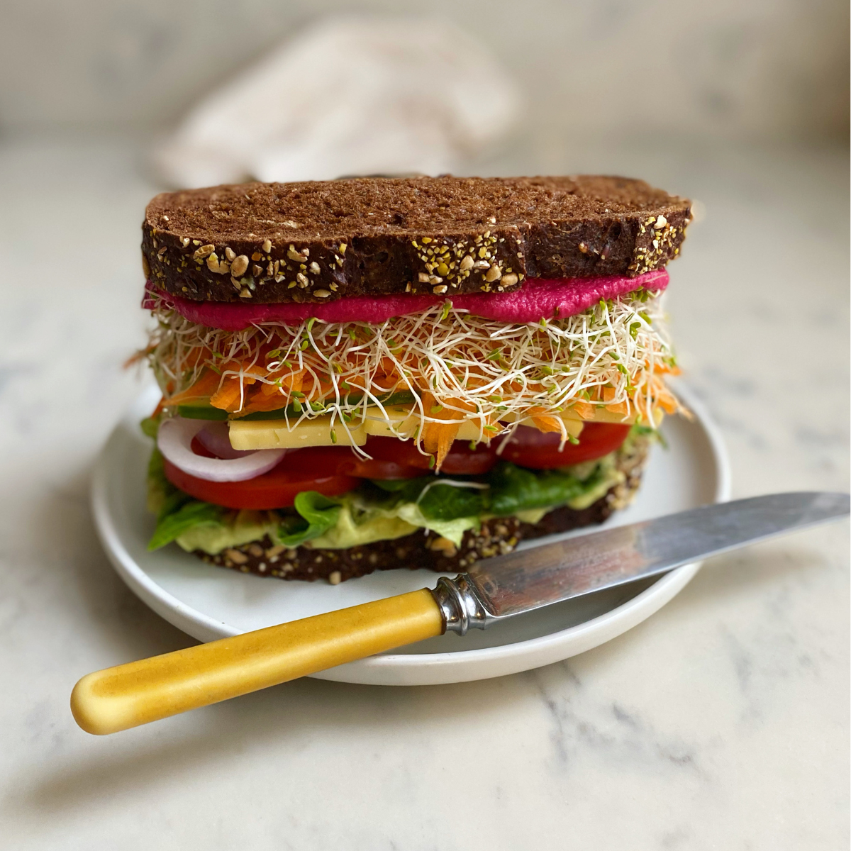
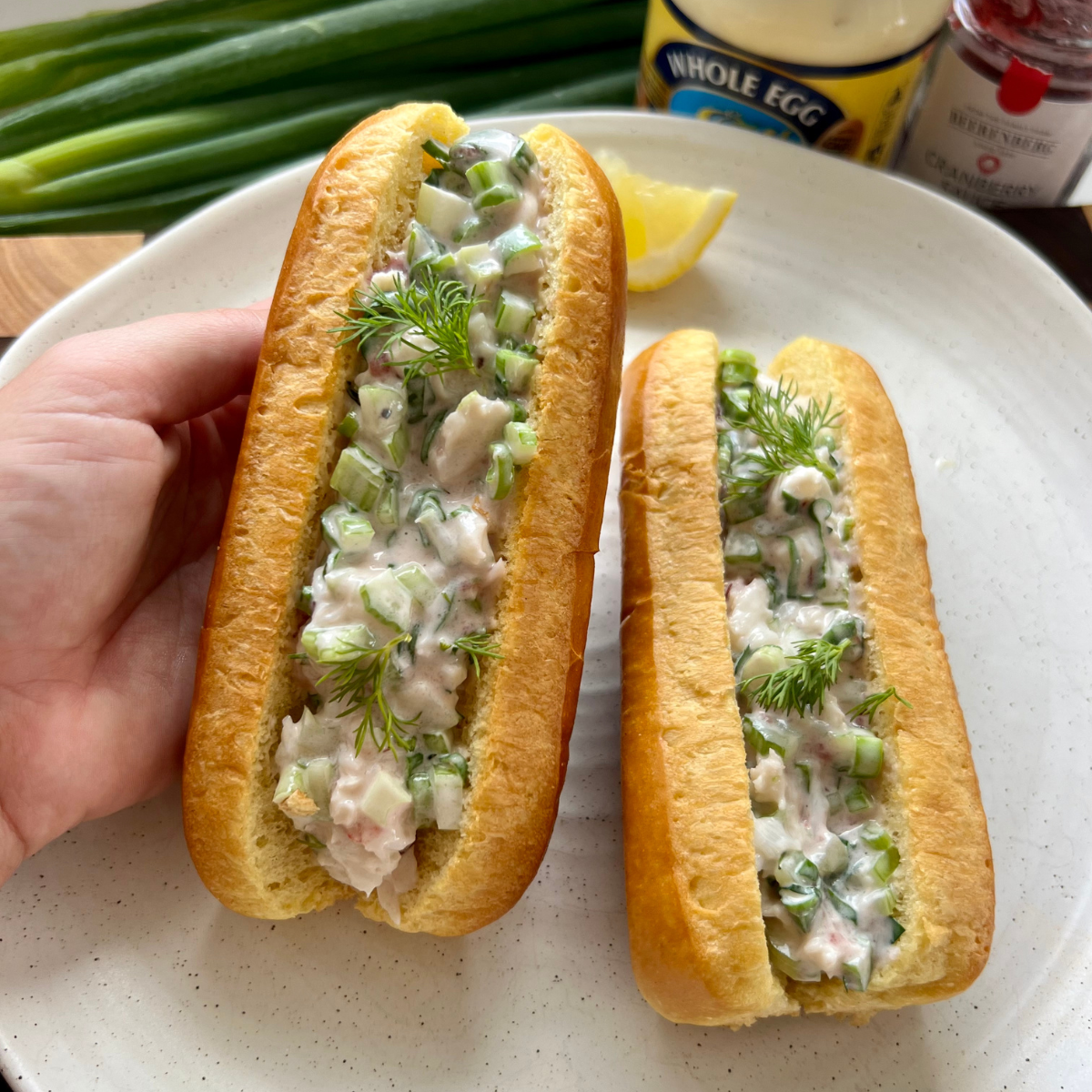
ULTIMATE TUCK SHOP SANDWICH
Enjoy this recipe as a dip, a dressing for BBQ vegetables, with roast lamb or dolloped onto salads.
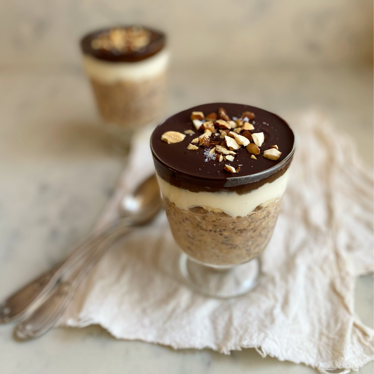
BANOFFEE OVERNIGHT OATS
These banoffee overnight oats are a healthy spin on the classic British pie consisting of pastry, caramel, bananas, cream & chocolate shavings. They take less than 10 minutes to prepare and make a luxurious yet nutritious breakfast on busy mornings!
One Pan Lasagna
This one pan lasagna is convenient, budget friendly and absolutely delicious.
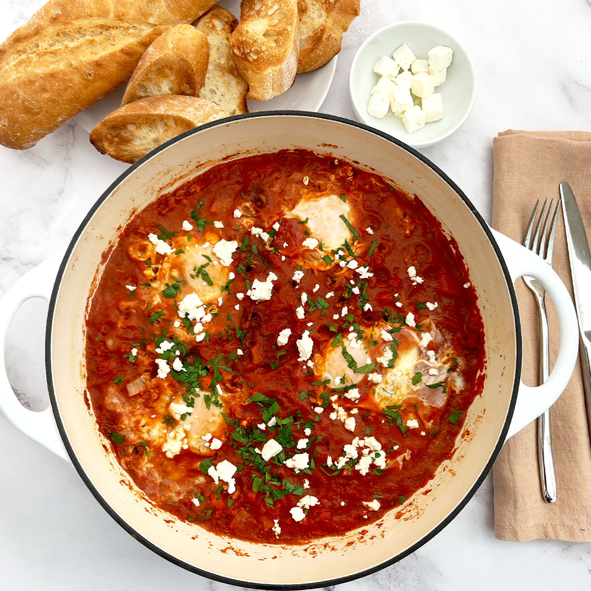
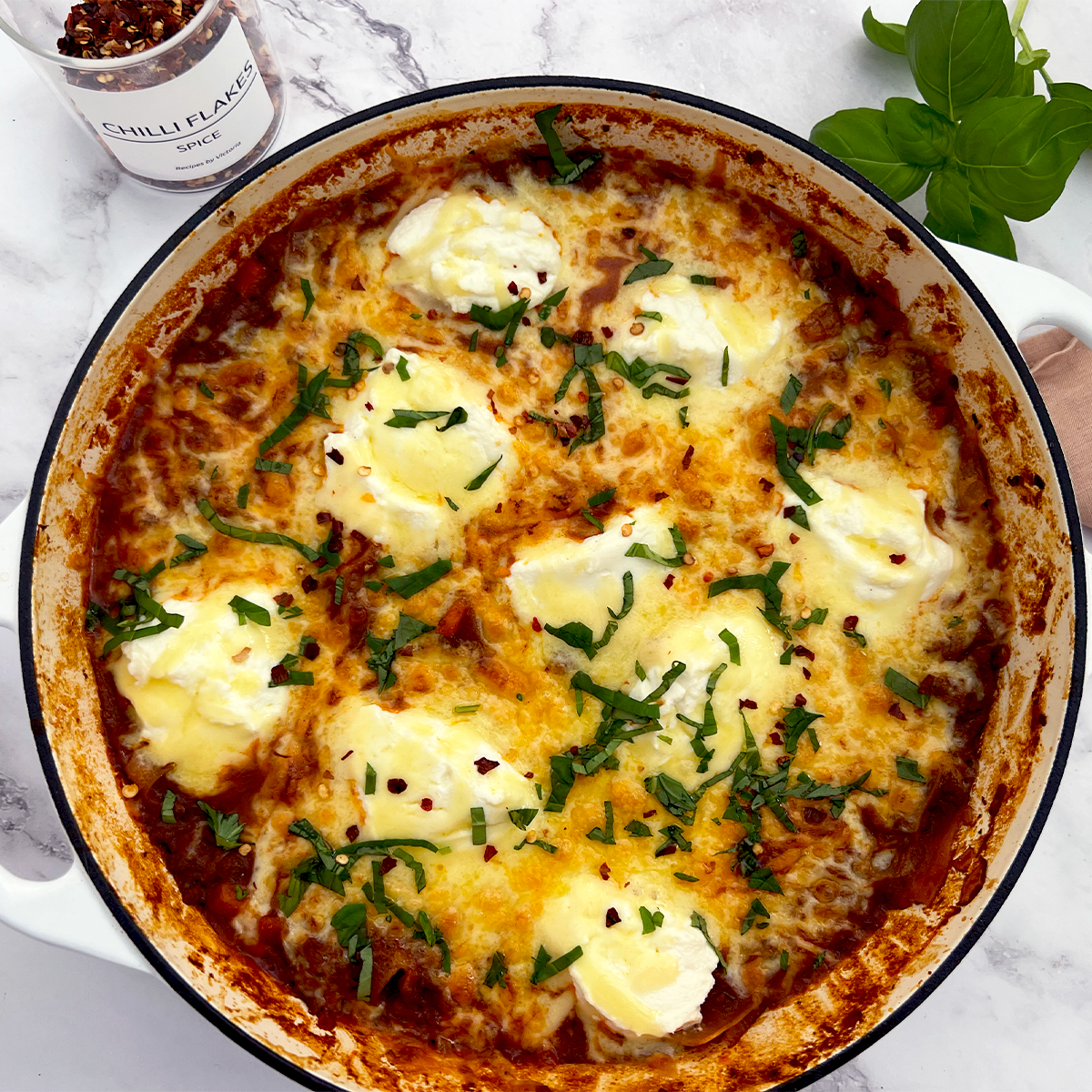
One Pan Shakshuka
This 5 steps one pan Shakshuka recipe can be enjoyed at anytime of the day.
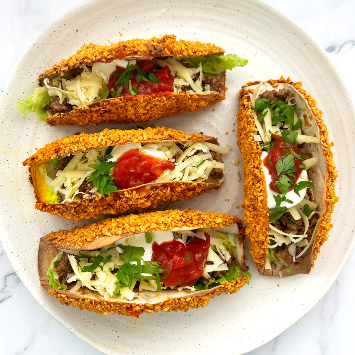
Dorito Tacos
Your Taco recipe with an extra layer of crunch and flavouring.
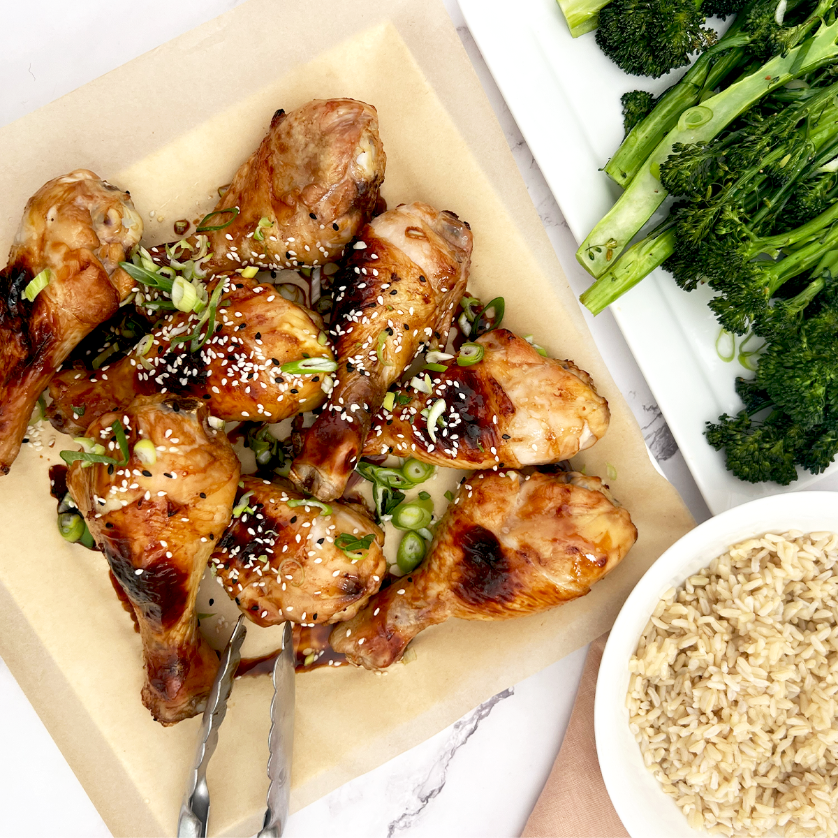
Honey Soy Chicken Drumsticks
Your go-to 15 minute and budget friendly Honey Soy Chicken Drumsticks recipe.
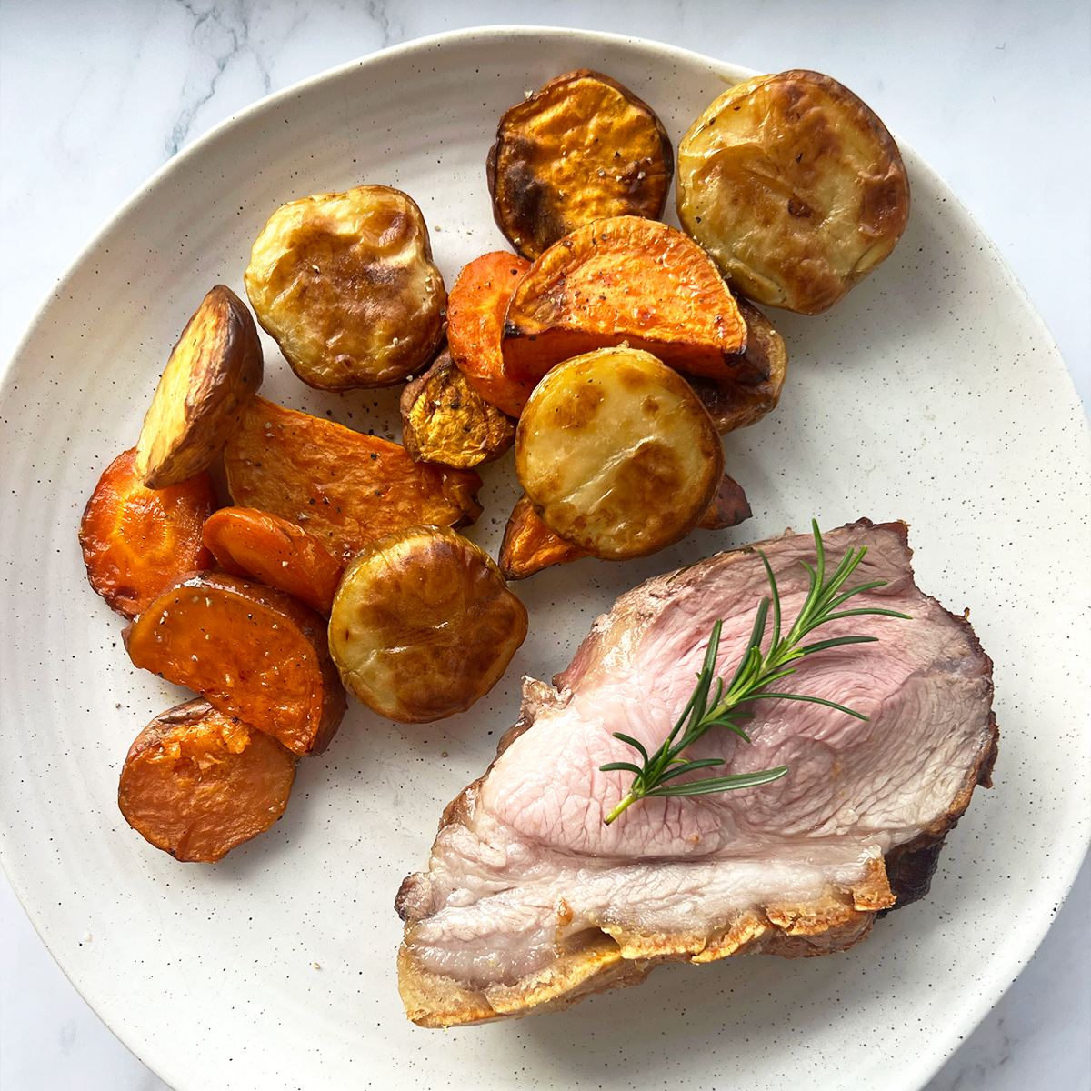
Juicy Pork Roast
This family-friendly meal is less than $20*, all it takes is some olive oil, salt, pepper, a little over an hour in the oven and you’ve got yourself a huge hit!
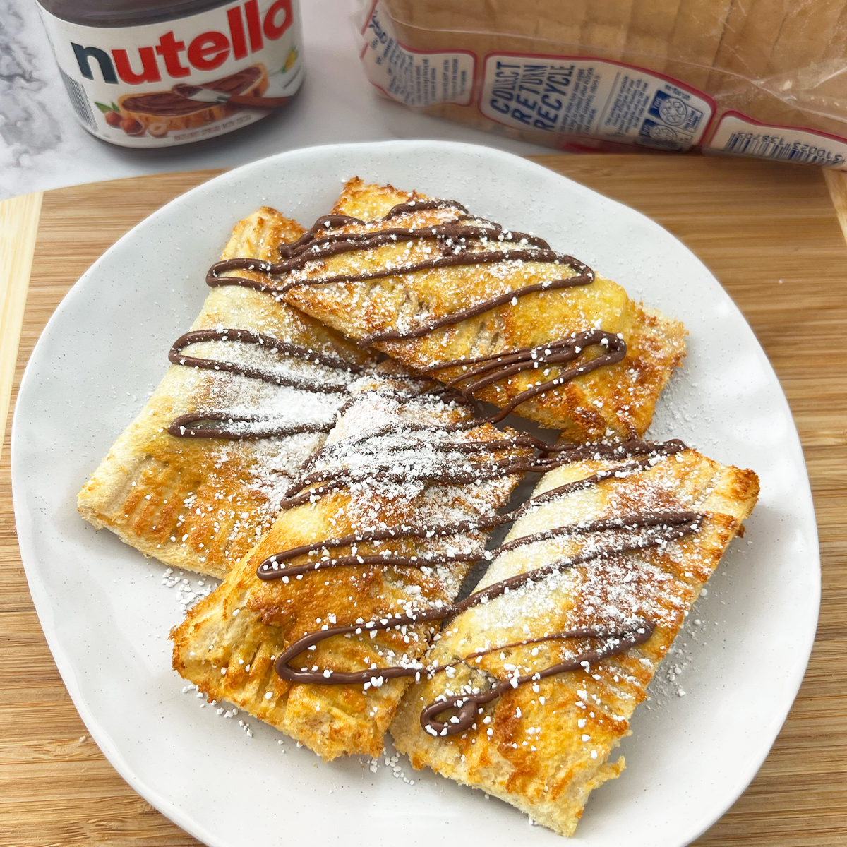
Nutella Toast Pies
Who doesn’t love Nutella? These toast pies are easy to make and easy to please.
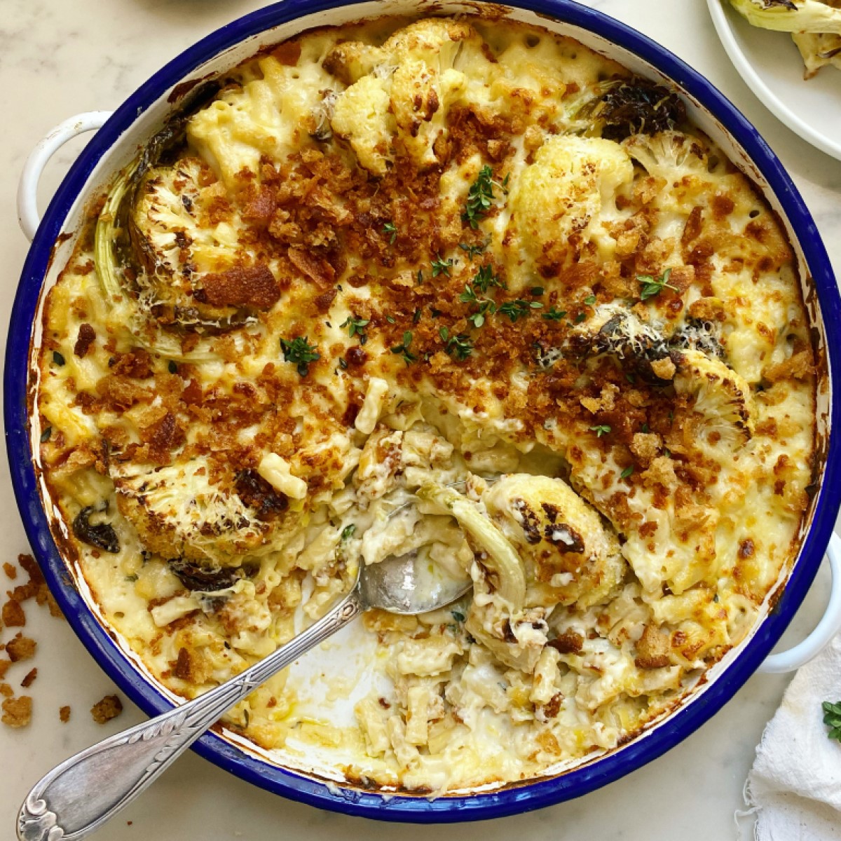
Cauliflower Mac and Cheese with Burnt Butter
Feed the family for less than $20 with this twist on a traditional Mac & Cheese!
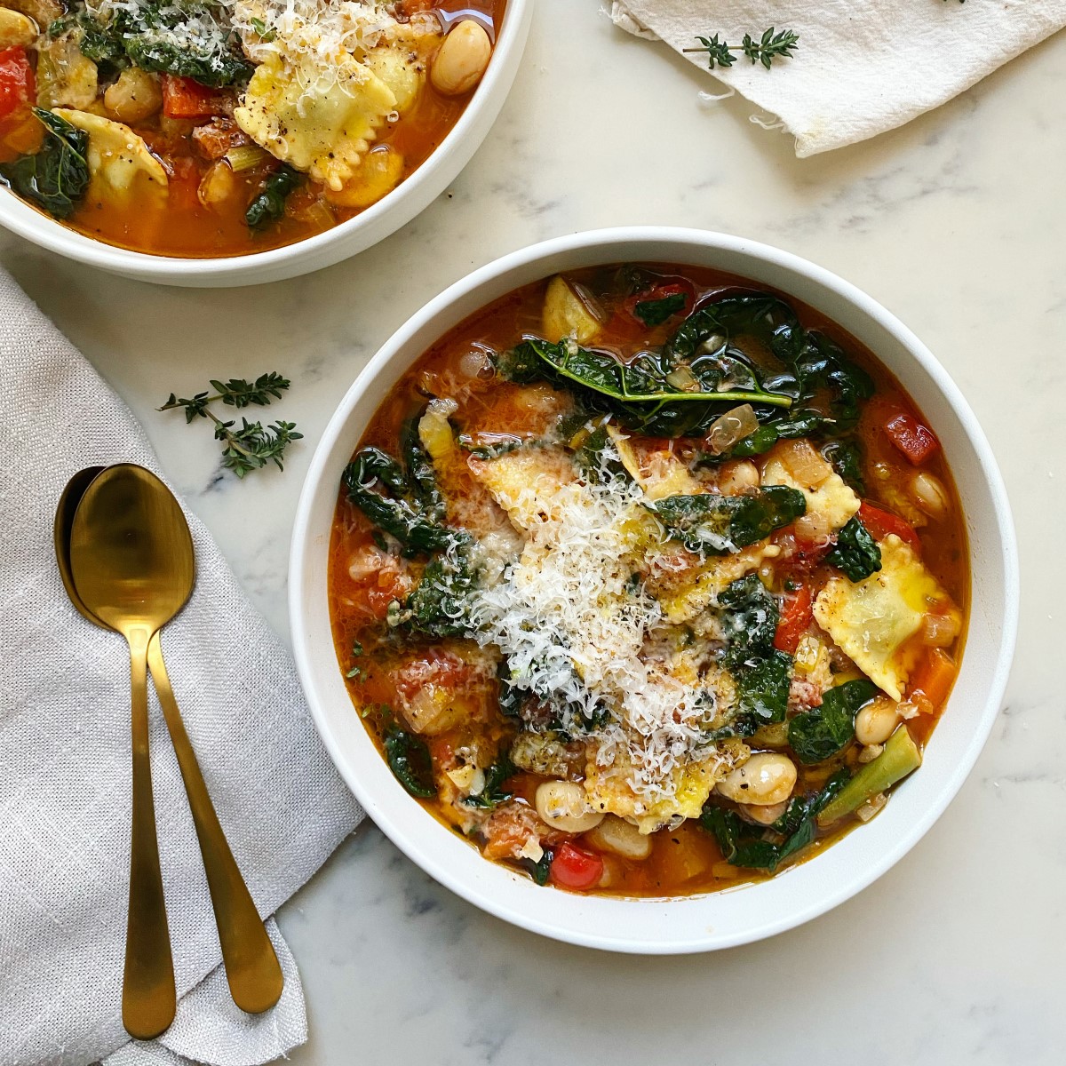
Pimped Up Minestrones with Ravioli
Who said the classics have to be boring? Pimp up everyone's favourite winter soup with a few pantry staples and voila!
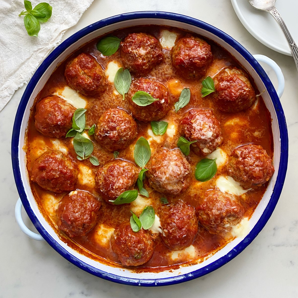
Pork, Fennel & Mozzarella Meatballs
What's the only thing better than a one-pan recipe? A one-pan recipe to feed the entire family for less than $20! Try these super easy, super cheesey meatballs.
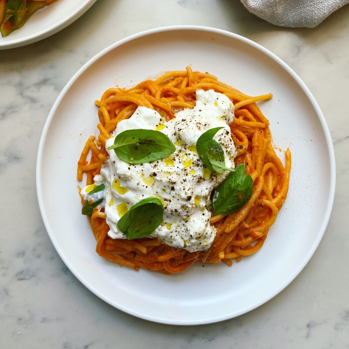
Roast tomato & burrata spaghetti
Don't let this simple recipe fool you! This five ingredient spaghetti is full of flavor and as easy as it is impressive.

Pork and ginger wonton noodle soup
Healthy and hearty this flavorful wonton soup with quick chilli oil is the perfect winter warmer for less than $20!
Cauliflower salad with smashed chickpeas & tahini yoghurt
Your new favourite easy mid-week lunch or dinner awaits. Packed full of nutrients, this colourful salad is perfect to prep ahead of time!
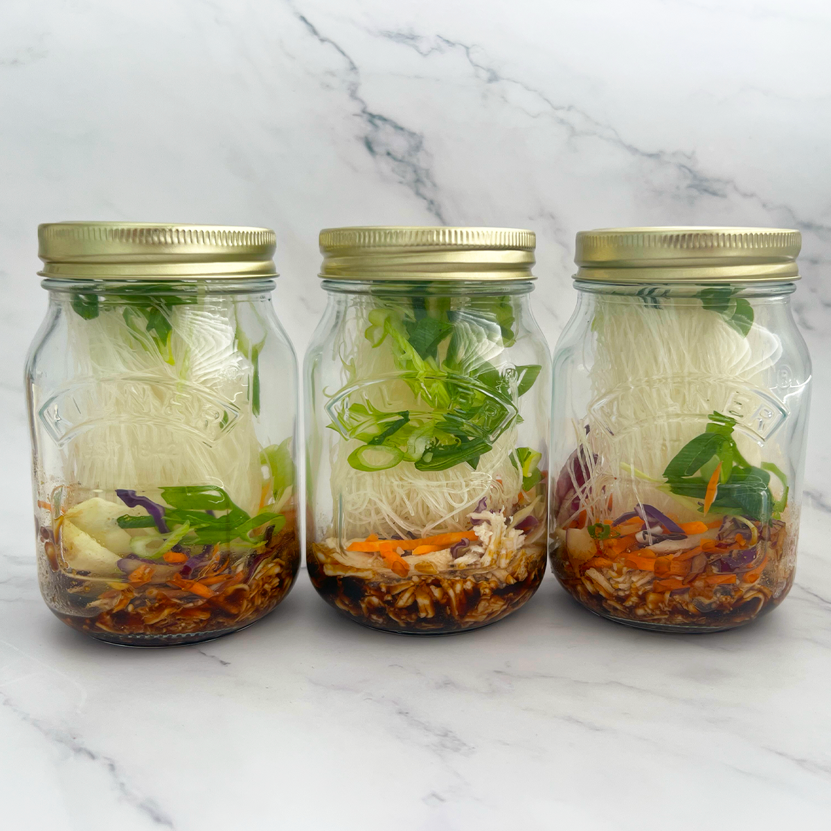
Miso Chicken Noodle Jars
Level up your meal prep this summer with these delicious miso chicken noodle jars.
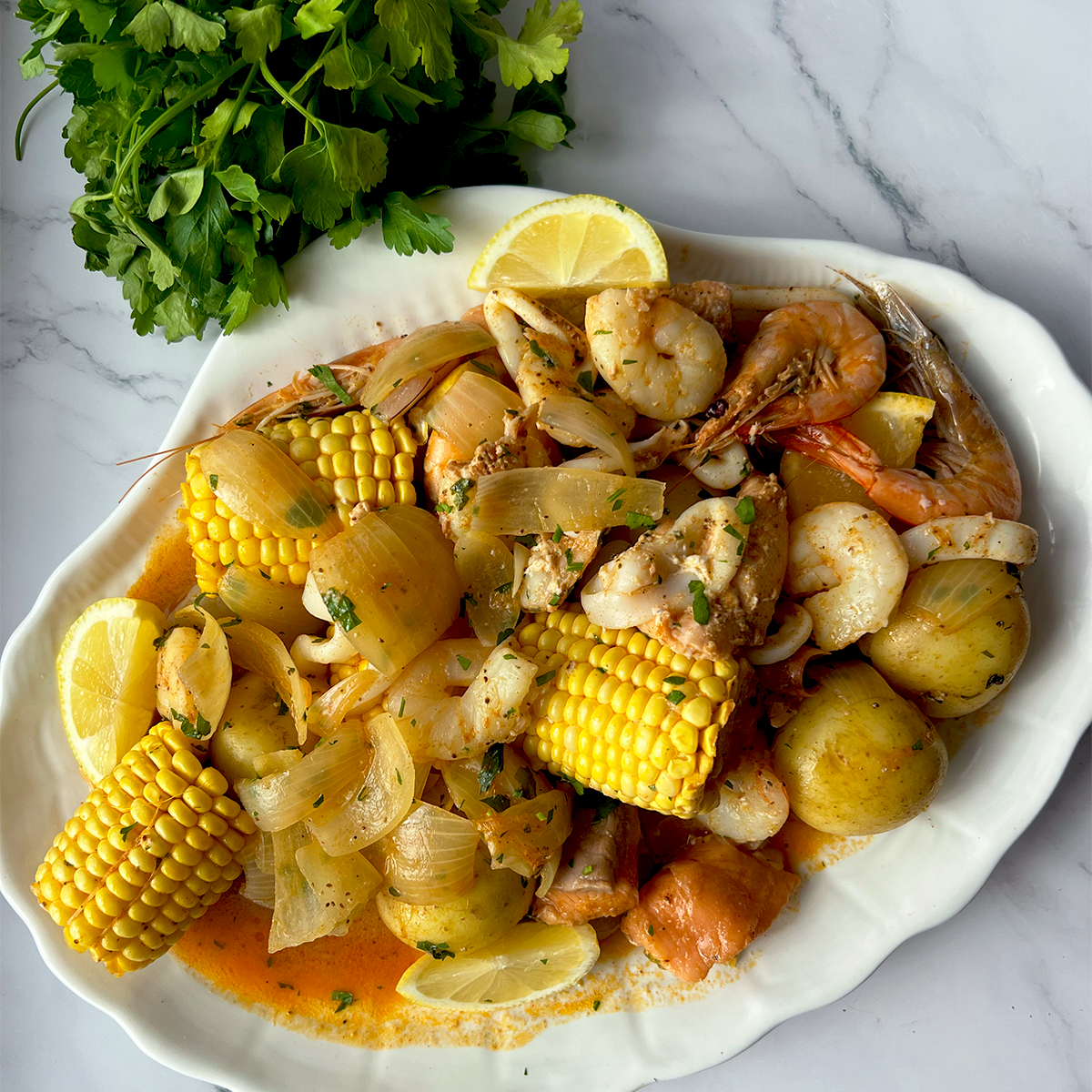
SEAFOOD BOIL BAG
This dish was made to impress. Inspired by a recipe we saw at restaurant, “Kickin In”, we wanted to recreate a more budget friendly, at home version.

Gifting, Valentine's Day
Valentine's Day Gift Inspiration
Whatever you love, get inspired by the list we've curated for you.

Gifting, Lunar New Year
Lunar New Year Gift Guide
Not sure what to bring to celebrate the Year of the Rabbit? Get inspired with gifts that are sure to impress!
Christmas, Food, Recipes
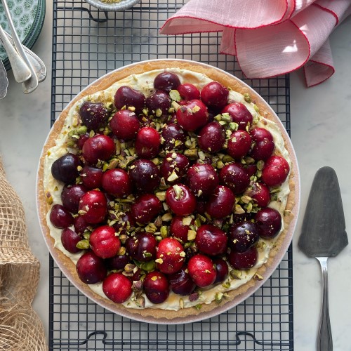
CHERRY & VANILLA MASCARPONE TART
This delicious dessert using everyone's favoruite summer stone fruit, the cherry, is just as impressive as it looks!
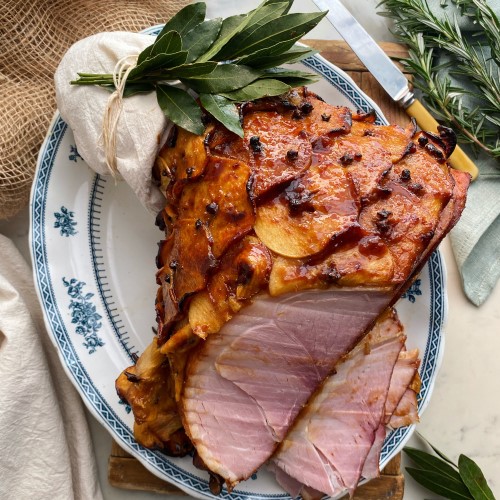
Christmas, Food, Recipes
APPLE, MISO & HONEY GLAZE HAM
Not your regular Christmas Ham, this super easy variation on everyone's favoruite Christmas day meal is set to become your new go-to recipe!
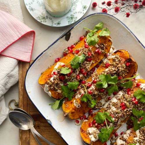
Christmas, Food, Recipes
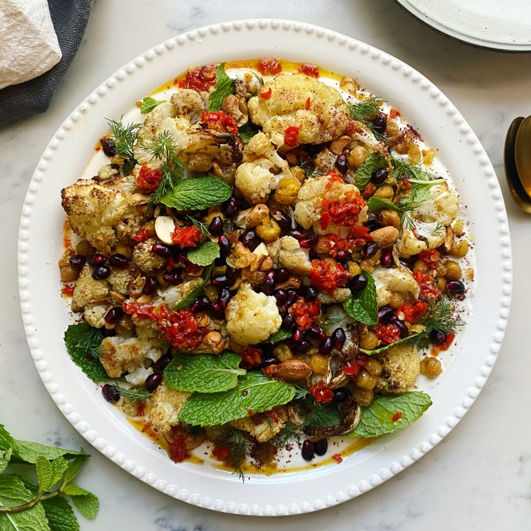
ROAST PUMPKIN WITH CASHEW CREAM, POMEGRANATE & SPICED SEEDS
Sweet and delivious roast pumpkin to brighten up your Christmas spread.
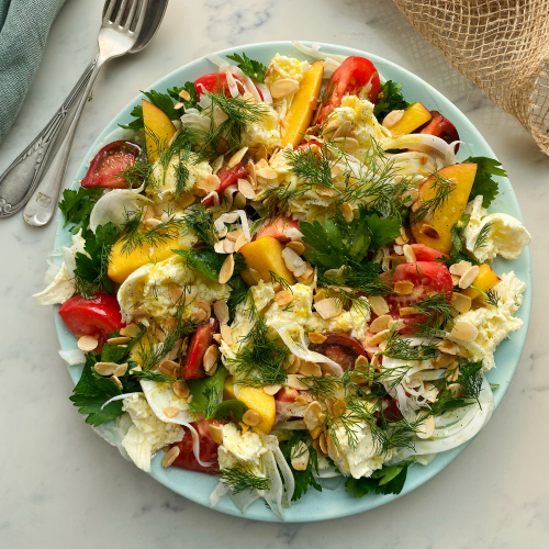
Christmas, Food, Recipes
FENNEL, NECTARINE & MOZZARELLA SALAD
Fresh, bity and the perfect side for a summer Christmas feast. Celerate the silly season with the freshest produce of the summer.
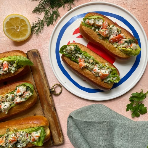
Christmas, Food, Recipes
PRAWN BRIOCHE ROLLS WITH LEMON & DILL
The perfect summer starter - spice up your Christmas celebrations with these bright and fresh prawn brioche rolls!

Festive, Fashion
4 Party-ready Pieces to Wear on Repeat This Season
The silly season is here, and after two years of cancelled plans, there’s excitement in the air — and our wardrobes. We’ve rounded up four standout styles that’ll have you shining bright all season long. See you on the dancefloor 🍸

Lifestyle, Food, Recipes
Halloween cocktails and drinks to impress
Tasty and terrifying ideas for cocktails, mocktails, potions and brews that can be made for both adults and kids.

Beauty, Fashion, Family
Easy Halloween makeup ideas to try this year
Whether you want to go glam or ghoul, here are some fun and simple ideas to make you stand out this Halloween!
Fresh Food, Recipes
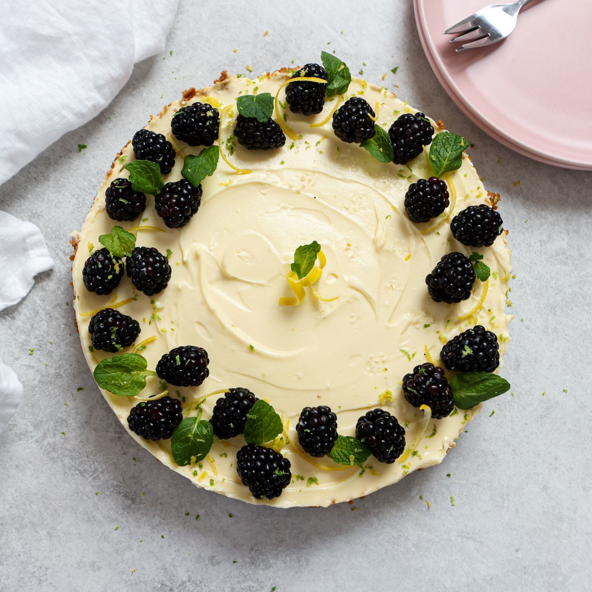
No bake lemon cheesecake
Warmer weather is calling, which means baking is off the table. Try this No Bake Lemon Cheesecake for your next picnic, made with a surprise Biscoff biscuit base, a zingy lemon cream and fresh blueberries.
Fresh Food, Recipes
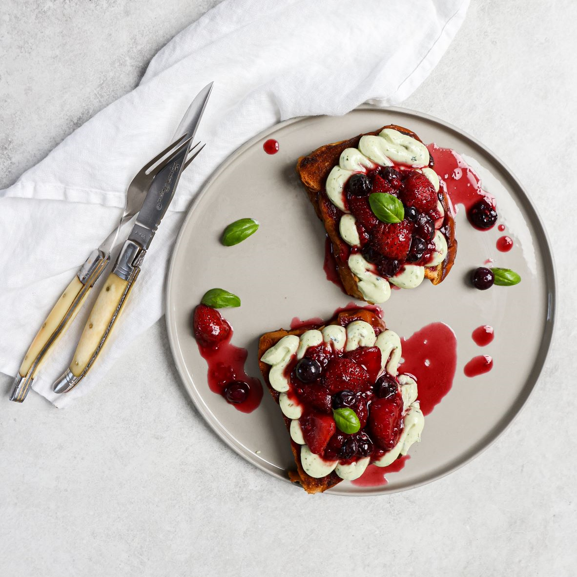
Whipped ricotta with truffle, honey & basil on toasted brioche & berry compote
Dessert looks a little different in spring and summer, and this sweet and zesty dish from @foodbylucy is at the top of our list. Starring a seasonal berry compote, lemon-infused ricotta cream and pan-fried brioche, it’s perfect for a Sunday long lunch.
Fresh Food, Recipes
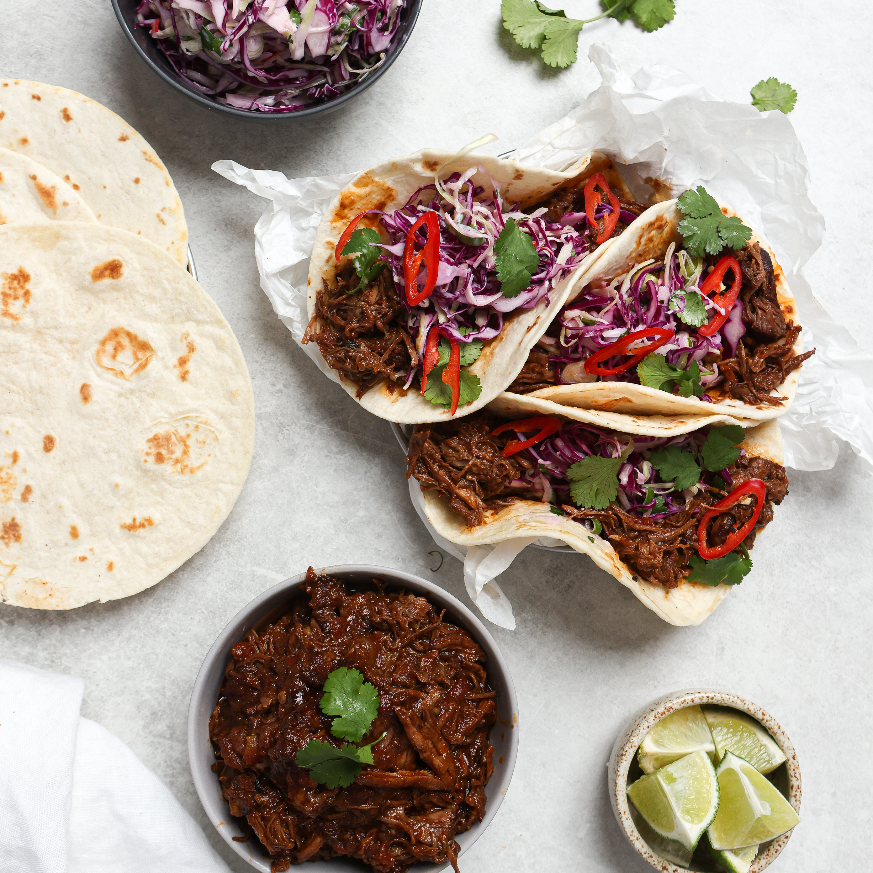
Slow cooked beef tacos with slaw
Slow cooked beef isn’t just a winter staple. Give it a spring makeover by whipping up these family favourite tacos, stuffed with tender beef and a fresh slaw, for a relaxed weekend dinner at home.
Recipe, Fresh Food
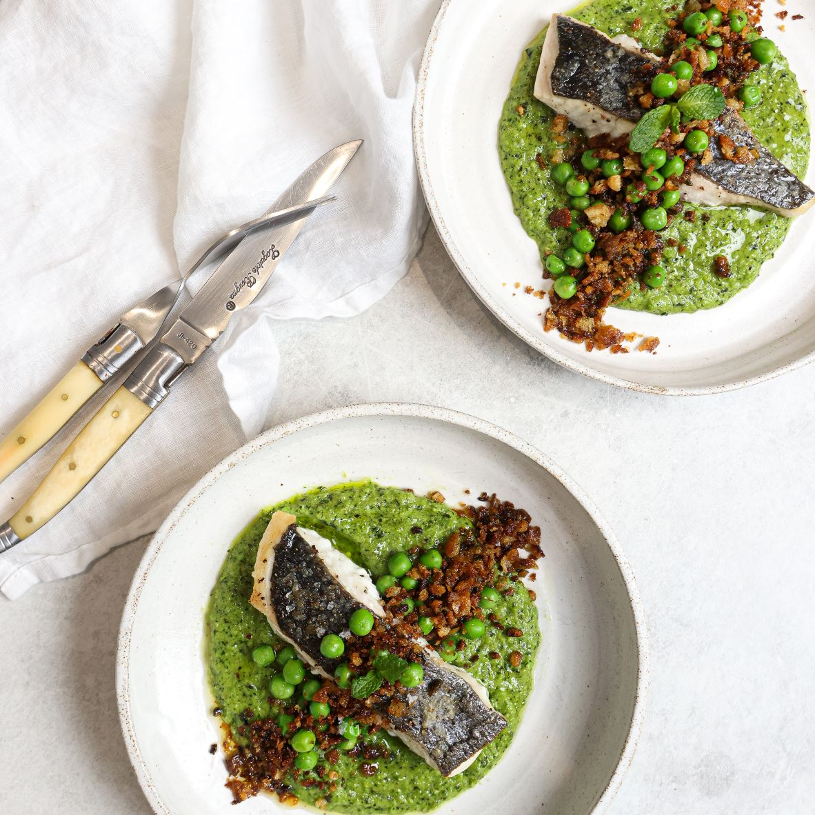
Pan seared cod with truffle, pea, mint purée with a lemon pangrattato
It’s official: we’re opting out of hearty winter dinners for the year. Joining us? Try this delicious dish by @foodbylucy, layered with light, fresh and flavour-packed ingredients like pan-seared cod and a pea and mint puree.
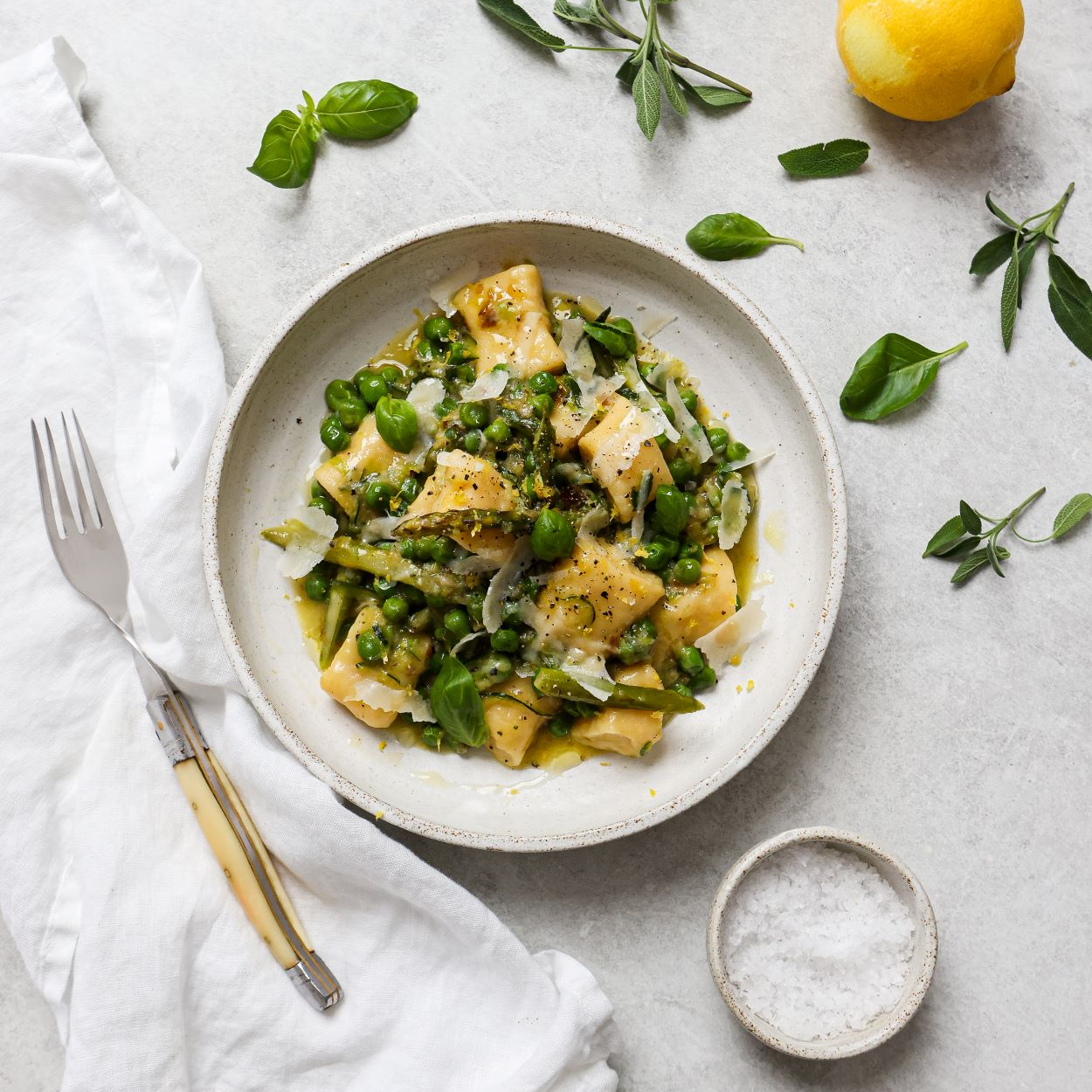
Fresh Food, Recipe
Ricotta gnocchi with spring vegetables in a burnt butter sauce
Homemade gnocchi doesn’t have to be complicated. Keep it simple with @foodbylucy’s easy recipe, and top it off with lashings of butter, garden green vegetables and fresh parmesan, naturally.
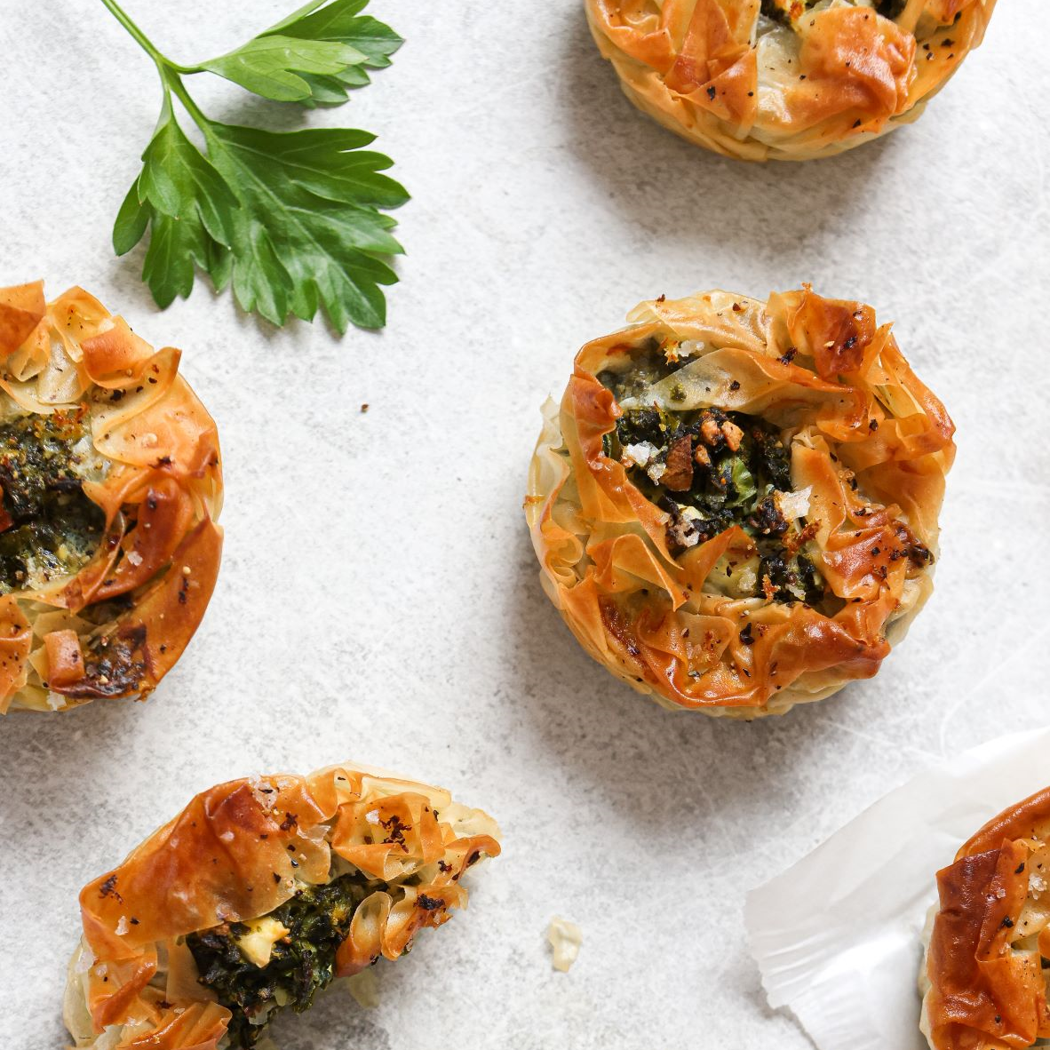
Fresh Food, Recipes
Spinach and feta pies
Spinach, feta and lemon, oh my… Whether you’re serving these for a long Sunday lunch with friends or as an early dinner for the family, we can guarantee there won’t be any leftovers.
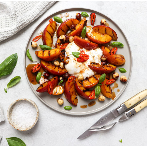
Fresh Food, Recipe, Health
Grilled nectarine & burrata salad
We’ve drooled over burrata with tomato and basil, and now it’s time to level up to burrata with charred nectarine. Take your lunch guests to Apulia, Italy with this Euro summer favourite!
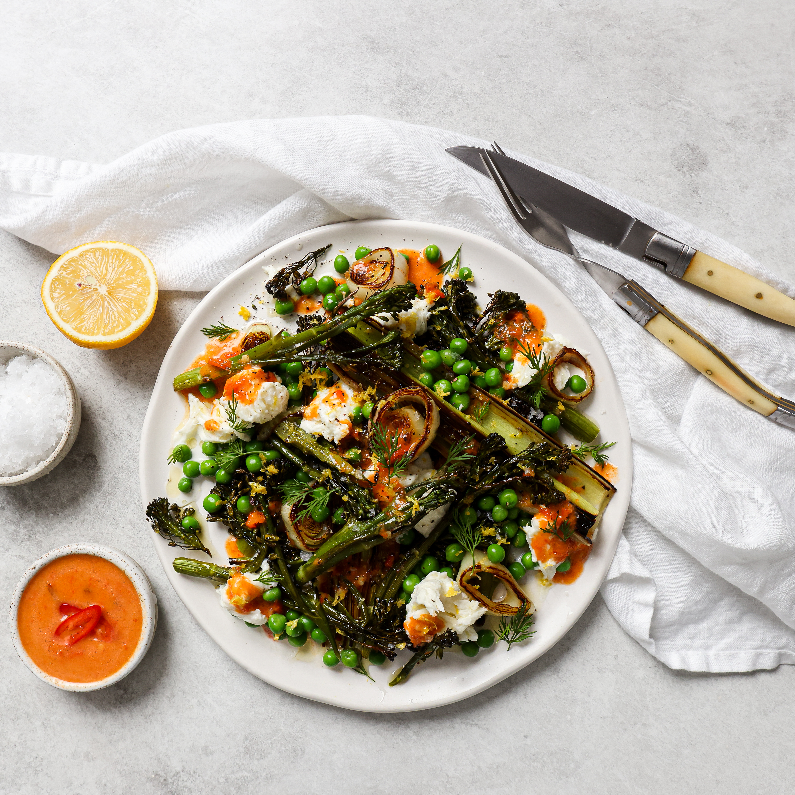
Food, Health, Lifestyle
Charred broccolini& leek salad with mozzarella & roasted chilli dressing
It’s salad, but not as you know it. For the spring season, upgrade your usual side to this warm Charred Broccoli, Leek and Pea Salad, topped with fresh mozzarella and a chilli and lemon dressing.

Lifestyle, Homewares, Hacks
Luxe Home Hacks for Less
Kmart, Big W and Target… They’re the official headquarters of home hacks, stylish decor and affordable luxury.
If your home is in need of an interior design overhaul, our fav department stores give you a chance to try the big trends at a fraction of the cost.
If your home is in need of an interior design overhaul, our fav department stores give you a chance to try the big trends at a fraction of the cost.

Lifestyle, Gadgets
Add These Travel Essentials to Your Packing Lists
Packing for a holiday somewhere sunny? Here’s the five items you can’t forget for a fuss-free vacay
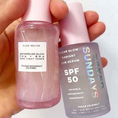
Lifestyle, Skincare
The Skincare You Need for Glowy Skin this Spring
If your skin is feeling a little sad post winter, we’ve got just the thing.

Fashion, Spring
High to Low Trench Coat Options and Where to Find Them
Not many designs have the power to remain in style for over a century. But the humble trench does just that. See where you can find some of our favourite on-trend trenches in store now - from high to low.

Gifting, Men's Style
What to Get Dad This Year - at Any Price Point
Whether your dad is into the latest tech gadgets, or loves to chef it up in the kitchen, there’s an art to buying gifts that they’ll actually love. Keeping them in mind is the first step.

Fresh Food, Recipe, Father's Day
How to make the ultimate Father's Day lunch
What’s better than breakfast in bed for Father’s Day? A blowout BBQ feast with the family.
Impress dad with your hosting skills and grilling technique and make his special day that much more tasty.
Impress dad with your hosting skills and grilling technique and make his special day that much more tasty.
Opening hours
Mon - 9am - 5.30pmTue - 9am - 5.30pm
Wed - 9am - 5.30pm
Thu - 9am - 9pm
Fri - 9am - 5.30pm
Sat - 9am - 5pm
Sun - 10am - 4pm
Our location
20 Smidmore Street
Marrickville, NSW 2204
Call us
02 9519 1066
Stores & services